

Filters and the Key Metrics row at the top of Insights
The Five Sections
A few charts behave in ways worth knowing:
- Click any step of the Application funnel to drill down into the candidates behind the number.
- In pipeline reflects right now, so it ignores the selected date range.
- Avg scorecard by recruiter averages the scorecards each teammate has submitted, which helps you spot unusually harsh or lenient evaluators.
Some KPIs need a minimum amount of data. Avg time to hire appears after your first hire, and Offer acceptance (signed offers divided by resolved offers) appears once at least 3 offers are resolved.
Filters, Date Ranges, and Grouping
The filter bar at the top of the page controls what every chart shows.
Individual charts have their own display controls on top of the global filters:
- Group by: break a chart down by Source, Job opening, Recruiter, Stage type, or Rejection reason. For example, group Applications by Source to see which channel fills your pipeline.
- Trend granularity: view trend charts Weekly or Monthly.
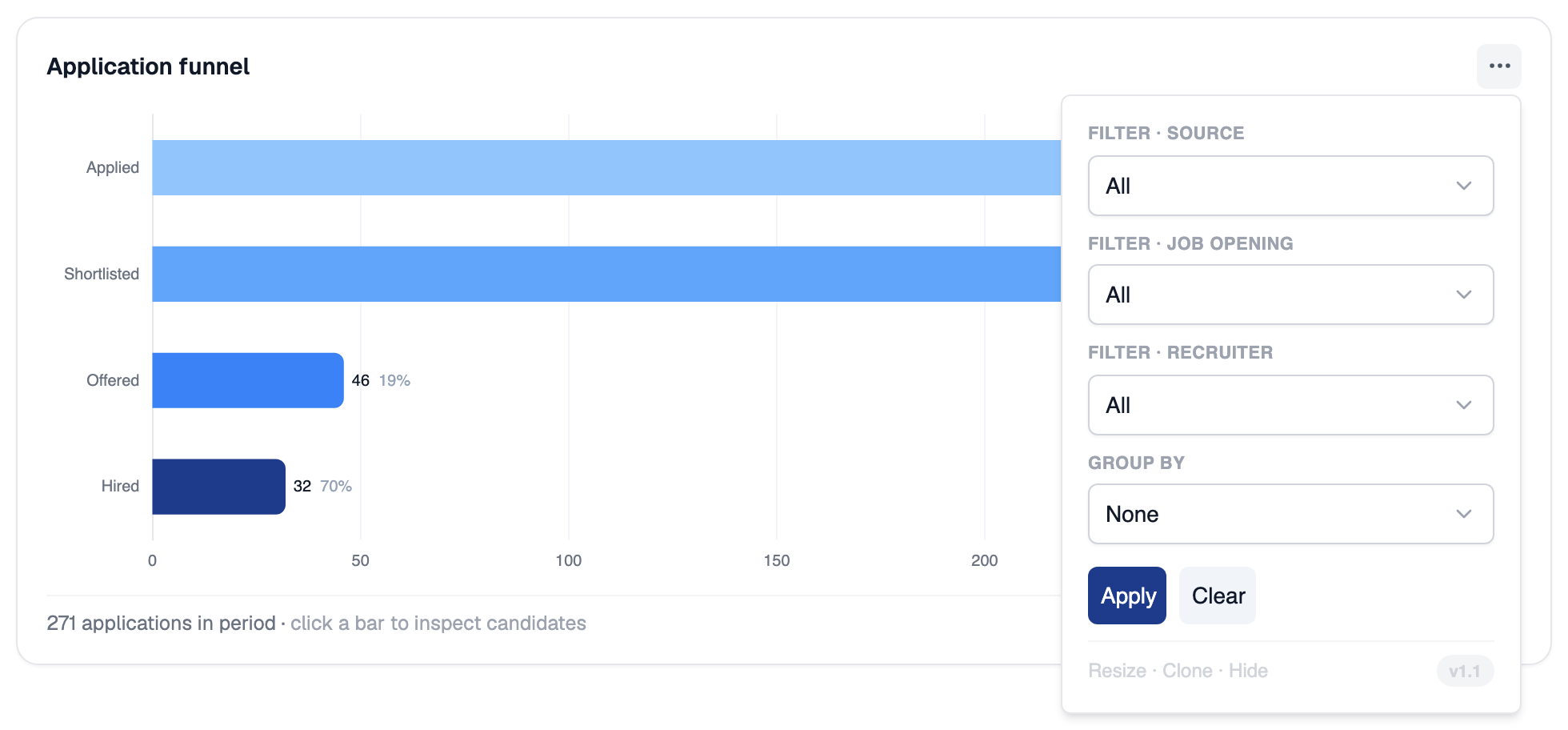
Each chart has its own filters and Group by in its options menu
Solo vs Squad Scope
The Solo / Squad toggle decides whose hiring activity the dashboard covers.
Squad scope relies on your team’s reporting structure, the manager-and-reportee mapping defined in your organization settings. Until managers and reportees are assigned, there is no squad to aggregate.
Related Resources
- Candidates and CVs - The applications dashboard that generates the data behind these charts
- Pipeline Stages - How stages are structured, which drives funnel and drop-off metrics
- Scorecards - Submitted scorecards feed the Avg scorecard by recruiter chart
- Job Fit Score - The AI score behind the Job-fit score distribution chart